Friday, December 29, 2017

Upgrading Moyhu infrastructure

I have spent part of the holidays tinkering with Moyhu's infrastructure. I keep copies of all posts and pages offline, partly for backup, and partly so I can search them and also make universal changes. This was of great value when Blogger required use of https a couple of years ago.

I was trying to revive the graphics gallery page, which never really recovered from that change, since it used copies of posts, which also need fixing. But I got side-tracked into upgrading the interactive topic index. I don't think readers use it much, but I do. Google provides a search for the blog, but it returns a display of complete posts, so needs precise search terms. The interactive search just returns a list of linked titles, so you get a wider sweep (maybe too wide).

The new index looks like this (non-functional image):


I had clicked on the Marcott button, and the list of links (with dates) appears below. The topics have been extended, and groups in to color-coded types. The types are listed on the left. I have extended the topics considerably. They mostly work by a keyword search, so you get some false positives. I added some at the end (housekeeping, debunkings) which don't have natural keywords, and were manually identified. And I have separated out the three series of monthly postings that I do (NCEP/NCAR, TempLS and GISS). It makes them easier to find, but because I exclude he keyword search for them, it reduces the false positives.

The new arrangement should be much easier to update regularly.

I have also added a blog glossary. We're used to tossing around terms like CRUTEM, but not everyone is, so I have given a basic description (with links). I have added it to the bottom page , now called "More pages, and blog glossary". The more pages part is just a few lines of links at the top, and then comes the glossary. I'm sure it will need extending - suggestions welcome.

That was my New Year's resolution for 2017 :)

Saturday, December 23, 2017

Merry Christmas to all


Christmas starts early this year at Moyhu, so I'll take this opportunity to wish readers a Merry Christmas and a Happy New Year. Hopefully bushfire-free. In the spirit of recent examinations of past wildfires (Eli has more), I'll tell the story behind the picture above. The newspaper version is here.

In 2003 and 2006/7, alpine and upland Victoria were swept by long running and very damaging bushfires. The area concerned was rugged terrain and sparsely inhabited. Much was not so far below the snowline, so the trees there were not very tall, and the fuel somewhat less than for our wilder lowland fires. They were in summer, but not exceptionally hot weather, and of course cooler there. Consequently they burnt relatively slowly, with a fair chance of defending critical areas. Some were fought with great energy and danger to crews; this could not be expended everywhere, so they burnt for weeks and did much damage to mountain forests that take a long time to regrow.

In December, 2006, our most popular ski resort, Mt Buller, was surrounded by fires, again burning over long periods. Although as said the conditions did not make for extreme wildfire, any eucalypt fire is dangerous when it runs up a hill slope. The many buildings of Mt Buller sit near the peak at about 1500 m altitude, and there is a single winding road out, which became impassable on 22nd December. So the fire crews who had assembled were on their own. Fortunately, the resort had a large water storage used for snow-making. But there was a long perimeter to defend.

By the 23rd, flames were at that perimeter. I was at Buller the following winter, and saw that it had come right up to a northern edge road, with major buildings just on the other side. And it was pretty close on all sides. Fortunately, some rain came that evening, but still, there were more flareups on Christmas Eve.

At last, later on the Eve, more serious rain came with another change in the weather, and somewhat amazingly for our summer solstice, it turned to snow. That indeed marked the end of the danger to the mountaintop. In the morning, when they awoke to a very welcome white Christmas, this photo was taken.

Again, may your Christmas be as merry. With special hopes for those in the region of the Thomas fire.


Wednesday, December 20, 2017

On Climate sensitivity and nonsense claims about an "IPCC model"

I have been arguing recently in threads where people insist that there is an "IPCC model" that says that the change in temperature is linearly related to change in forcing, on a short term basis. They are of course mangling the definition of equilibrium sensitivity, which defines the parameter ECS as the ratio of the equilibrium change in temperature to a sustained (step-function) rise in forcing. So in this post I would like to explain some of the interesting mathematics involved in ECS, and why you can't just apply its value to relate just any forcing change to any temperature change. And why extra notions like Transient Climate Sensitivity are needed to express century scale changes.

The threads in question are at WUWT. One is actually a series by a Dr Antero Ollila, latest here, "On the ‘IPCC climate model’". The other is by Willis Eschenbach "Delta T and Delta F". Willis has for years been promoting mangled versions of the climate sensitivity definition to claim that climate scientists assume that ∆T = λ∆F on a short term basis, giving no citation. I frequently challenge him to actually quote what they say, but no luck. However, someone there did have better success, and that made it clear that he is misusing the notion of equilibrium sensitivity. He quoted the AR5

"“The assumed relation between a sustained RF and the equilibrium global mean surface temperature response (∆T) is ∆T = λRF where λ is the climate sensitivity parameter.”"

Words matter. It says "sustained RF" and equilibrium T. You can't use it to relate any old RF and T. A clear refutation of this misuse is the use also of transient sensitivity (TCS). This typically is defined as the temperature change after CO₂ increased by 1% per year, compounding over 70 years, by which time it has doubled. CS is normally expressed relative to CO₂ doubling, but it is linked to forcing in W/m² by
∆F = 5.35* ∆log([CO2])
which implies ∆F = 3.7 W/m² for CO₂ doubling. Both ECS and TCS express the same change in forcing. But one is an initial change sustained until equilibrium is reached; the other is temperature after that 70-year ramp. And they are quite different numbers; ECS is usually about twice TCS. So there can't be a simple rule that says that ∆T = λ∆F for any timing.

A much better paradigm is that ∆T is a linear function of the full history of forcing F. This would be expressed as a (convolution) integral

∆T(t)=∫w(t-τ)*F(τ) dτ, where the integral is from initial time to t.

The weight function w is unknown, but tapers to zero as time goes on. I've dropped the ∆ on F, now regarding F as a cumulative change from the initial value, but a similar integral with increments could be used (related by integrating by parts).

This is actually the general linear relation constrained by causality. w is called the impulse response function (IRF). It's the evolution (usually decay) that you expect of temperature following a heat impulse (F dt), in the absence of any other changes. That pulse F*dt at time τ would then have decayed by a factor w(t-τ) by time t, and by linear superposition, the effect of all the pulses of heat that would approximate the continuous F over the period adds to the stated integral.

I gave at WUWT the example of heating a swimming pool. Suppose it sits in a uniform environment, and has been heated at a uniform burn rate, and settles to a stable temperature. Then you increase the heating rate, and maintain it there. The response of the pool might be expected to be something like:


I'm actually using an exponential decay, which means the difference between current and eventual temperature decays exponentially. That is equivalent to the IRF being an exponential decay, and the curve has it convolved with a step function. The result, after a long time, is just the integral of w. This might be called the zeroth order moment. It is what I have marked in blue and called the ECS value. The linearity assumed is that this value varies linearly with the forcing jump. It doesn't mean that T is proportional to F. How could it be, if  F is held constant and T is still warming?

So let's look at that ECS convolution integral graphically:


Red is the forcing, blue the IRF, purple the overlap, which is what is integrated (IOW, all of it).

But suppose we are just interested in shorter periods. We could use a different forcing history, which would give a number relevant to the shorter term part of w. I'll use the linear ramp of TCS, this time just over the range 4-5:


I could have omitted the 0-4 section, since there is zero integrand there. However, I wanted to make a point. The integral now is weighted to the near end of the IRF. Since the IRF conventionally has value 1 at zero, it could be represented over the range of the ramp by a linear function, and the resulting integral would give the slope. That is why I identified TCS with the slope at zero of the response curve. But it isn't quite, because w isn't quite linear.

So this shows up a limitation of TCS. It doesn't tell about the part of w beyond its range. That's fine if we are applying it to a forcing known to be zero before the ramp commences. But usually that isn't true. We could extend the range of the TCS (if T data is available) but then it's utility of giving the derivative w'(0) wuld lessen. That means that it wouldn't be as applicable to ranges of other lengths.

Because of the general noise, both of observation and GCM computation, this method of getting aspects of the IRF w by trial forcings is really the only one available. It gives numbers of some utility, and is good for comparing GCMs or other diagnostics. And in the initial plot I tried to show that if you have the final value of the evolution and the initial slope, you have a fair handle on the whole story. That corresponds to knowing an ECS and a short term TCS.

But it isn't a "model" of T versus forcing. That model is the IRF convolution. The sensitivity definitions are just extracting different numbers that may help.


Burning history - fiery furphies.

This post is about some exaggerated accounts that circulate about past forest fires. The exaggeration had been part of a normal human tendency - no-one cares very much whether accounts of events that caused suffering inthe past may be inflated, and so the more dramatic stories win out. But then maybe it does begin to matter.

I have two topics - the history of wildfire in the US, and a particular fire in Victoria in 1851. When people start to wonder about whether fires are getting worse in the US, as they seem to be, then a graph is trotted out to show how much worse things were in the 1930's. And if there is a bad fire in Australia, the 1851 fire is said to be so much worse. This is all to head off any suggestion that AGW might be a contributor.

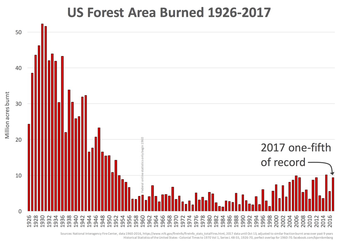
I'll start with the US story. The graph that appears is one like this:


This appeared in a post by Larry Kummer a few days ago. He gave some supporting information, which has helped me to write this post. I had seen the plot before, and found it incredible. The peak levels of annual burning, around 1931, are over 50 million acres, or 200,000 sq km. That is about the area of Nebraska, or 2.5% of the area of ConUS. Each year. It seems to be 8% of the total forest area of ConUS. I'm referring to ConUS because it was established that these very large figures for the 1930's did not include Alaska or Hawaii. It seemed to me that any kind of wildfires that burnt an area comparable to Nebraska would be a major disaster, with massive loss of life.

So maybe the old data include something other than wildfires. Or maybe they are exaggerated. I wanted to know. Because it is pushed so much, and looks so dodgy, I think the graph should not be accepted.

Eli has just put up a post on a related matter, and I commented there. He helpfully linked to previous blg discussions at RR and ATTP

Larry K, at JC's, traced the origin of the graph to a 2014 Senate appearance by a Forestry Professor (Emeritus), David South. He is not a fan of global warming notions. Rather bizarrely, he took the opportunity of appearing before the Senate committee to offer a bet on sea level:

"I am willing to bet $1,000 that the mean value (e.g. the 3.10 number for year 2012 in Figure 16) will not be greater than 7.0 mm/yr for the year 2024. I wonder, is anyone really convinced the sea will rise by four feet, and if so, will they take me up on my offer?"

Prof South's graph did not come from his (or anyone's) published paper; he has not published on fire matters. But it was based on real data, of a sort. That is found in a document on the census site: Historical Statistics of the United States p537. That is a huge compendium of data about all sorts of matters. Here is an extract from the table:


As you can see, the big numbers from the 30's are in "unprotected areas". And of these, the source says:

"The source publication also presents information by regions and States on areas needing protection, areas protected and unprotected, and areas burned on both protected and unprotected forest land by type of ownership, and size of fires on protected areas. No field organizations are available to report fires on unprotected areas and the statistics for these areas are generally the best estimates available."

IOW, an unattributed guess. That that is for the dominant component. Federal land fires then are basically less than modern.

The plot mostly in circulation now, and shown by Larry K above, is due to a Lomborg facebook post.

The organisation currently responsible for presenting US fire history statistics is the National Interagency Fire Center. And their equivalent table lists data back to 1960, which pretty much agrees where it overlaps with the old census data to 1970. But they rather pointedly go back no further. And at the bottom of the table, they say (my bold):

"Prior to 1983, sources of these figures are not known, or cannot be confirmed, and were not derived from the current situation reporting process. As a result the figures above prior to 1983 shouldn't be compared to later data."

So not only do they not show data before 1960; they advise against comparison with data before 1983.

Interestingly, ATTP noted that a somewhat similar graph appeared on a USDA Forest Service at this link. It now seems to have disappeared.

I think these graphs should be rejected as totally unreliable.

The Victorian Bushfires of 1851.

First some background. Victoria was first settled in 1834, mainly around Melbourne/Geelong (Port Phillip District), with a smaller area around Portland in the West. In Feb 1851, the time of the fires, the region was still part of the colony of New South Wales. Two big events to come later in the year were acquiring separate colony status, and the discovery of gold, which created a gold rush. But in Feb, the future colony had about 77,000 people, mainly around Melbourne/Geelong. There were no railways or telegraphs, and no real roads outside that region.

There undoubtedly was a very hot day on Thursday Feb 6, 1851, and the populated area was beset with many fires. It may well have been the first such day in the seventeen years of the region, and it made a deep impression. This site gathers some reports. But the main furphy concerns claims of statewide devastation. Wiki has swallowed it:

"They are considered the largest Australian bushfires in a populous region in recorded history, with approximately five million hectares (twelve million acres), or a quarter of Victoria, being burnt."

A quarter of Victoria! But how would anyone know? Nothing like a quarter of Victoria had been settled. Again, virtually no roads. No communications. Certainly no satellites or aerial surveys. Where does this stuff come from?

It is certainly widespread. The ABS, (our census org) says
" The 'Black Thursday' fires of 6 February 1851 in Victoria, burnt the largest area (approximately 5 million ha) in European-recorded history and killed more than one million sheep and thousands of cattle as well as taking the lives of 12 people (CFA 2003a; DSE 2003b)"
It is echoed on the site of the Forest Fire Management (state gov) .The 1 million sheep (who counted them?) and 12 people are echod in most reports. But the ratio is odd. People had very limited means of escape from fire then, and there were no fire-fighting organisations. No cars, no roads, small wooden dwellings, often in the bush. Only 12, for a fire that burnt a quarter of Victoria?

The ABS cites the CFA, our firefighting organisation. I don't know what they said in 2003, but what they currently list is the 12 people killed, and 1000000 livestock, but not the area burnt.

By way of background, here is a survey map of Victoria in 1849. The rectangles are the survey regions (counties and parishes). It is only within these areas that the Crown would issue title to land. That doesn't mean that the areas were yet extensively settled; the dark grey areas are currently purchased. I think even that may be areas in which there are purchases, rather than the area actually sold.


There are a few small locations beyond - around Horsham in the Wimmera, Port Albert, in Gippsland, Portland, Kyneton and Kilmore. This is a tiny fraction of the state. So even if a quarter of the state had burnt, who would be in a position to assess it?

So what are the original sources? Almost entirely a few newspaper articles. Here is one from the Melbourne Argus, on Monday 10th Feb, four days after the fire. They explain why they judiciously waited:

"In our Saturday's issue we briefly alluded to the extensive and destructive bush fires that prevailed throughout the country, more particularly on the Thursday preceding. Rumours had reached us of conflagrations on every side, but as we did not wish to appear alarmists, we refrained from noticing any but those that were well authenticated, knowing how exceedingly prone report is to magnify and distort particulars. Since then, however, we learn with regret that little only of the ill news had reached us, and that what we thought magnified, is unhappily very far from the fearful extent of the truth."

And they give an exceedingly detailed listing of damages and losses, but all pretty much within that surveyed area. A large part of the report quotes from the Geelong Advertiser. There is a report from Portland, but of a fire some days earlier. Many of the fires described are attributed to some local originating incident.

There is an interesting 1924 account here by someone who was there, at the age of 12 (so now about 85). It gives an idea of how exaggerated notions of area might have arisen. He says that the conflagration extended from Gippsland northward as far as the Goulburn river. But even now, a lot of that country is not much inhabited. It's pretty clear that he means that fires were observed in Gippsland (a few settlements) and the Goulburn (probably Seymour).

So again, where does this notion of 5 million hectares come from? I haven't been able to track down an original source for that number, but I think I know. Here (from here) is a common summary of the regions affected "'Fires covered a quarter of what is now Victoria (approximately 5 million hectares). Areas affected include Portland, Plenty Ranges, Westernport, the Wimmera and Dandenong districts. Approximately 12 lives, one million sheep and thousands of cattle were lost'"

Those are all localities, except for the Wimmera, which is a very large area. But the only report from Wimmera is of a fire at Horsham, virtually the only settled area. Another formulation is from the CFA:

"Wimmera, Portland, Gippsland, Plenty Ranges, Westernport, Dandenong districts, Heidelberg."

Apart from the western town Portland, and "Wimmera", the other regions are now within the Melbourne suburbs (so they left out Geelong and the Barrabool ranges, which seems to have been seriously burnt). So where could 5 million hectares come from? I think from the reference to Wimmera. Some reports also list Dandenong as Gippsland, which is a large area too. I think someone put together the Wimmera, which has no clear definition, but Wiki puts it at 4.193 million hectares. With a generous interpretation of Westernport and Portland, that might then stretch to 5 million hectares. But again, Wimmera has only one settled location, Horsham, where there was indeed a report of a fire.


Tuesday, December 19, 2017

GISS November global down 0.03°C from October, now 0.87°C.

GISS cooled slightly, going from 0.90°C in October to 0.87°C in November (GISS report here). That is very similar to the decrease (now 0.064°C with ERSST V5) in TempLS mesh. It was the third warmest November on record, after 2015 and 2016. It makes it almost certain that 2017 will be the second warmest in the record (after 2016): December would have to average 0.51°C for 2015 to catch up, and December has been warmer than November so far.

The overall pattern was similar to that in TempLS. Cool in Canada and far East Siberia. Warm in W Siberia, and very warm in the Arctic. A cool La Nina plume.

As usual here, I will compare the GISS and previous TempLS plots below the jump.

Saturday, December 16, 2017

New version of monthly webGL surface temperature map page.

Moyhu has a maintained page here showing monthly surface temperature anomalies in an interactive webGL spherical shaded plot. The anomalies are based on the TempLS analysis, using unadjusted GHCN V3 and ERSST V5. TempLS provides the triangular mesh and normals (base 1961-90), and the anomalies are just the station monthly averages with these subtracted. The shading is set to give correct color at the nodes (stations). It is updated daily, so also provides a detailed picture from early in the month (which means the first few days are sparse).

The page had used its own webGL program, with a month selection mechanism (using XMLHTTPrequest to dowload data). I have been developing a general webGL facility (described here), and I wanted to make a nw page that conforms with that. This makes extra facilities available and is easier for me to maintain.

To do this I had to extend the WebGL facility, to a version I am currently calling V2.2. It is a considerable restructure, which will probably become V3. It enables me to replace the constructors of various parts of the page within the user files that go with each application, rather than writing it into the core facility. There were issues with making variables (and functions) visible to functions defines in separate files. I'm also now rather extensively using the MoyJS library.

The functionality of older MoyGL versions is preserved, and so, I hope, is the functionality of the page. One novelty of the version is a reintroduction of the flat globe pointing mechanism, which I used before WebGL. In the top right corner is a world map; you can click on any place to make the globe turn to show this point in he centre, with the longitude vertical (oriented). Otherwise, it's pretty much as in V2.1 as used previously.

The month selector is different. It is the box in the top right corner:


The three colored bars let you select decade (1900-2010), year (0-9) and month(1-12). The black squares show the current selection. As you click on the bars, these move, and the date in the red box below changes accordingly. When you have the date you want, click "Fetch and Show" and the data will be retrieved and a new plot will appear.

Since I am using unadjusted anomalies (1961-90), some exceptions will show out. I discussed here a method for remedying this, and of course adjusted data would also help. I am not currently using that method, which makes extrapolated current expected value the anomaly base. It is good for recent years, but gets troublesome in earlier years. I may offer it as an alternative some time.


Friday, December 8, 2017

November global surface temperature down 0.04°C

TempLS mesh anomaly (1961-90 base) was down from 0.724°C in October to 0.683°C in November. This compares with the larger reduction of 0.12°C in the NCEP/NCAR index, and a much greater fall (0.27) in the UAH LT satellite index. The TEmpLS average for 2017 so far is 0.720°C, which would put it behind 2016, and just behind 2015 (0.729°C). It's unlikely that December will be warm enough to change that order, or cool enough to lose third place (0.594°C in 2014).

Update 10 Dec: As Olof noted in comments, although I had tested and enabled use of ERSST 5 (instead of 4) earlier this year, it wasn't actually implemented (failure to correctly set a switch). It doesn't make much difference on a month to month basis. The fall in November was 0.064°C instead of 0.04°C, and the spatial pattern is very similar. But as he astutely noted, it does make a difference to 2017 versus 2015. The means for the last three years are 0.729, 0.835, and 0.758. That puts 2017 0.029°C clear of 2015, which means 2017 will be in second place if December exceeds 0.41°C, which seems likely.

The anomaly pattern showed two marked warm spots in W Siberia and N of Bering Strait, and less pronounced in SW US. Cool in Canada and E Siberia, fairly warm near the poles. Theer was a weak La Nina pattern; much less than with the NCEP/NCAR index.

Here is the temperature map:


Monday, December 4, 2017

November NCEP/NCAR global anomaly down 0.12°C from October

In the Moyhu NCEP/NCAR index, the monthly reanalysis anomaly average fell from 0.372°C in October to 0.253°C in November, 2017, making it the coolest month since June. The month started warm, with a cold period mid-month, and ended warm.

The main cold spots were China and E Siberia, and Canada. Arctic was warm, as were SW USA and European Russia. The Pacific showed a rather La Nina like pattern; cold in the SE and a band at the Equator. Warm around New Zealand/Tasmania.